We’ve written ad nauseum in these pages about the distorted and misleading economic data that have been produced during the unprecedented economic volatility of the pandemic. Despite turning a skeptical eye on hundreds of data releases over the past twelve months, we continue to find novel ways in which the data are inaccurate, often in material ways that undercut the conventional narrative and seem to be lost on most commentators.
We take no joy in being a gadfly buzzing about the government economists collecting and publishing this data. They are doing their best to apply traditional methods to an exceptional economic environment. Our criticism mostly lies with the commentators in the financial media and elsewhere who report these familiar economic data without doing the necessary homework to consider how distorted they may be. More than anything else, we care because these talking heads have relied on flawed data to support an economic narrative that has been far too pessimistic throughout the last year. We do not discount the real economic pain let alone the human suffering experienced during the pandemic, but the fact of the matter is that the economy has vastly outperformed the consensus forecast throughout the pandemic.
Phantom Jobless Claims
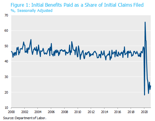
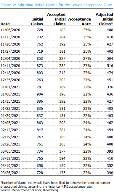
The latest anomaly was brought to our attention by Michael Feroli , the Chief U.S. Economist at JP Morgan. It relates again to the jobless claims data that we’ve written about in the past. In addition to using a nonsensical seasonal adjustment method, the claims data have also been inflated by outright fraud and what Feroli euphemistically refers to as “aspirational claim filing.” The weekly initial jobless claims data that are reported each Thursday are just that: claims. In normal times, just under half of those claims are accepted and receive benefits. During the first twelve months of the pandemic, the number of initial claims filed exceeded the number of initial benefits paid by over 44 million. As a result, the initial claims acceptance rate dropped from a pre-pandemic average of 45% to an average of 25% over the past seven months.

To put this in perspective, initial jobless claims have been running at an average pace of 722,000 per week over the past month. While this is a vast improvement from the multi-million weekly prints of last spring, it is still far above the weekly claims figures in a typical recession. Many commentators have pointed to these data as evidence of a weak labor market. However, if the number of jobless claims were consistent with the historical relationship to the number of benefits actually being paid, then the weekly figure would be running at 386,000 per week. Our guess is the talking heads would be telling a different story under those circumstances.

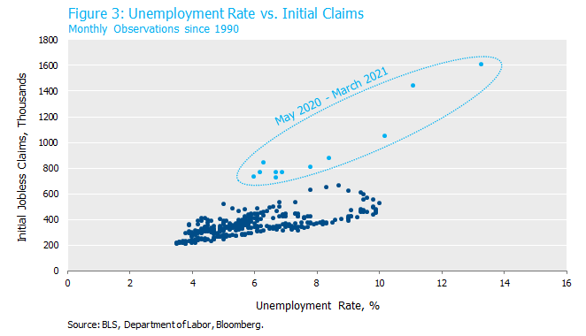
We can also demonstrate the inflated nature of initial claims by comparing them to the unemployment rate. As shown in Figure 3, the most recent months deviate substantially from the historical pattern. The unemployment rate has registered between 6.0 and 6.2% on 19 occasions in the past thirty years prior to the pandemic. In those months, initial jobless claims averaged 377,000 with a range of 303,000-483,000. That’s about half the level of initial claims in the past two months when the unemployment rate printed 6.0 and 6.2%. The picture below makes it obvious.

Originally published on April 14, 2021. Revised on April 27, 2021.
Download the PDF
To download a PDF version, please click here.


